Eroded decorative TrueType font, distributed via major repositories
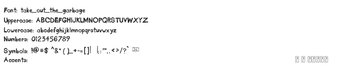
Take Out The Garbage, from developer Take Out The Garbage, is a decorative eroded typeface intended for informal, grunge-style layouts. The font gives messy, handwritten letterforms that shape short-form headlines and graphic accents rather than long passages. Its visible wear and irregular strokes create a weathered display tone while fitting into standard desktop workflows. The tool targets graphic designers and hobbyists who need a distinctly distressed headline face for creative projects.
Who benefits most from this typeface?
The typeface suits designers and hobbyists who need an overtly distressed display face for posters, social posts, and personal artwork, as indicated by its classification under the 'Fancy' and 'Eroded' themes. The face was designed by Kirk Shelton and first appeared in 2009, and it has broad community uptake, demonstrated by reported download figures exceeding 240,000 on a major font repository.
What technical coverage and file format does it provide?
The package supplies roughly 236 to 239 glyphs, covering Basic Latin and Latin-1 Supplement plus punctuation and currency symbols, which makes it usable for many Western languages. The font is packaged as a TrueType (.ttf) file, a format that desktop applications commonly accept. The file is lightweight, roughly 40 to 56 KB, which simplifies distribution and insertion into design projects without significant storage overhead.
How straightforward is installation and cross-application use?
On Windows, standard installation follows the ZIP extract, then right-click the .ttf file and choose Install; it then appears in system font menus for Office, Adobe Creative Cloud, and most text editors. The typeface also works on macOS and any program that supports TrueType. Major repositories mark the font for open distribution, but the included readme holds the final licensing terms, so users should inspect that file before deploying the font in wider projects.
Practical choice for display headlines, limited for broader typographic use
The typeface is a purpose-focused option for designers who want a heavily eroded, handwritten headline face; its visual damage and single decorative treatment make it ill-suited for long-form or high-legibility applications. Use it where a worn, informal voice is the goal, and treat it as a display resource rather than a general-purpose family with multiple weights or refinements.